Incorporating colours in your home can be daunting especially if you have been so used to white walls. Picking a colour is such a commitment, how do you know if you are making the right choice? We ask a few experts to answer your questions about getting colour right in your home and what factors come into play.
1. What’s the most important thing to consider when choosing colours?
“Colour theory is a massive part of choosing the right hues for your project and what you choose has a big effect on how spaces make you feel,” says interior designer Nicola Ross. Essentially, hot colours like red and orange are energising, cool colours like blues and greens are calming, and earthy tones like brown and terracotta convey comfort, which explains why brown-toned neutrals gain traction in troubled times. Remember the colours you use will also be affected by light levels, adjacent spaces and existing elements, says Resene marketing manager Karen Warman. “Joinery, carpet and furniture will all have an impact on the paint colours you choose.”
2. Is it best to stick to a simple palette for the entire house?
“Consistency is important to ensure a space feels cohesive, but it’s also important for different areas to have their own character,” says interior designer Vanessa Webb. “Colour can be used to define spaces.” To keep consistency, pick a handful of colours and use them in varying quantities, like a vivid cobalt on the walls in one room but used as an accent in adjoining spaces. If you decide to use the same colour throughout, Karen advises. “Lighting has a major impact on how your colour looks, so it’s often best to use different strengths in rooms on different sides of the house to compensate for the natural lighting.”
3. What’s the quickest way to add colour?
Accessorise. Paint is an easy way to transform a room, but if you’re looking for a change you can make in an hour, consider styling accessories. “If I want to keep a colour scheme really versatile, I will add colour through the cushions and smaller accessories as these can be changed with the seasons to transform the space,” says Vanessa. For example, introduce a bright or pastel throw to signal the arrival of spring.
4. How do you wean yourself off white paint?
White is seen as the safest colour choice, but if you want to walk on the wild side, dip your toe into more colourful waters. “Think about the way you want a room to feel, then start small,” advises Nicola. “Media rooms can be more immersive with a stronger colour – rooms you don’t spend as much time in can be great areas to be more adventurous as you won’t tire as easily of bolder schemes.”

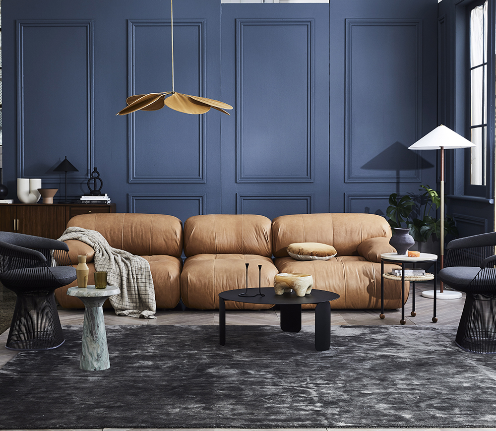
5. Is there an abiding rule for getting it right every time?
There are myriad rules in the colour canon – and just as many exceptions to them. But Vanessa suggests this simple guideline for rookie players: “Stick to a similar depth of colour – a combination of darker tones will feel moody and more dramatic, whereas lighter tones will feel more relaxed and more delicate. Mixing the two is much harder and adds a lot more energy to the scheme but needs to be carefully considered.”
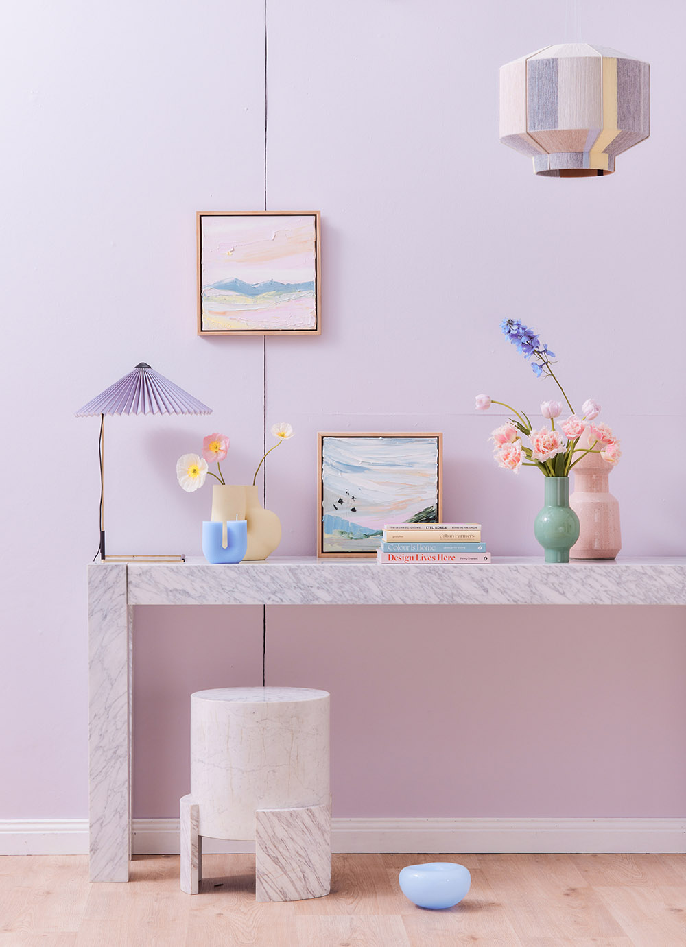
6. How do I add colour to a predominantly white interior?
A white interior is a blank canvas and anything you add to it will have enormous impact, which means you can start small with soft furnishings and a handful of accessories. Nicola suggests starting with objects you love, creating little pops of colour with displays of treasured items. “This is an easy way to bring warmth and add your vibe to a space,” she says.

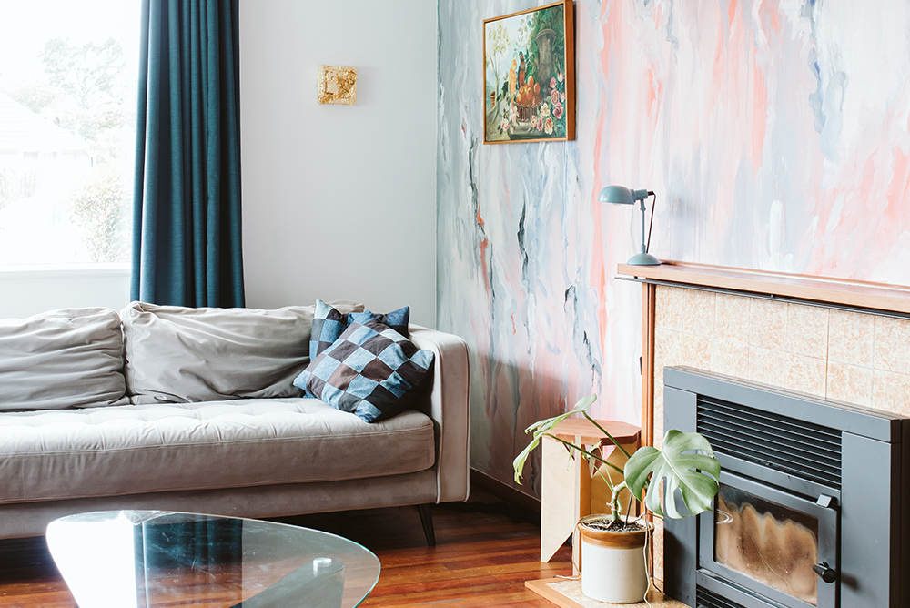
7. Are feature walls old hat?
The statement wall isn’t ready for retirement yet, but it has evolved. “We are seeing the accent wall move to areas like the ceiling or floor instead, or extending to be an accent colour that covers all the walls,” tells Karen, who suggests it’s a low-commitment way to enliven a space and build your colour confidence.
An accent wall can be more subtle still, says Nicola. “We are seeing a lot more textural elements like rendered walls and wood linings now.”
8. No-fail colour combos?
Leafing through an interiors magazine, certain colour schemes will appear over and over again because they just work. “White, green and wood is a timeless favourite, and classic navy and white will never date,” says Nicola. The former is calm, soothing and evocative of nature, while the latter speaks of sophistication, steadiness and security.
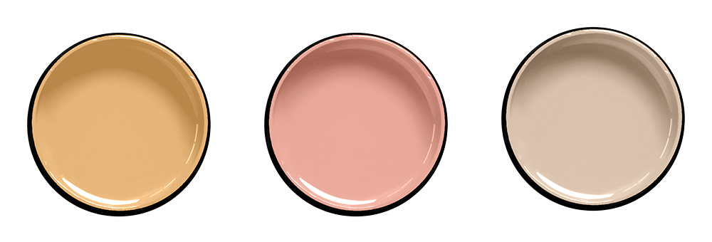
Resene colours to try (left to right): Resene See The Light, Resene Awaken, Resene Tua Tua
For help choosing colours to suit your projects, visit your local Resene ColorShop, ask a Resene Colour Expert online, www.resene.co.nz/colourexpert or book a Resene Colour Consultation, www.resene.co.nz/colourconsult.